![[BRAND] The Ginny Mones 2026 Rebrand header](/images/case-studies/branding-ginny-header.jpg)
[BRAND] The Ginny Mones 2026 Rebrand
Situation
The year is 2026 and you unearth your resume from four years ago. It looks okay, but parts of it feel stale, outdated. Kinda like you've outgrown it already, but there is a small part of you that sees yourself in that little piece of (digital) paper. Just that a lot has happened already in those four years that you haven't touched it, and you know it's time for a change.
That's the dramatic narrative running through my head as I rewrite this intro for the fifth time. For those who'd rather have it served plain and simple: my resume was getting stale, and my portfolio site was non-existent. Something had to change — and soon.
Solution and Key Design Decisions
Let's break this down into three parts:
Part One: The branding itself. While I did want to keep some of the past elements like the colors and the font, the image needed to be redrawn to look more modern and more representative of me. I didn't have my orange scarf (R.I.P. orange scarf, you are missed) and my hair wasn't orange anymore, after all. So I asked myself one thing: apart from the resume, where else would I use the image of mini me?
"Your portfolio site," said my brain. "I know you don't have one yet, but hear me out — the time to make one is NOW." With this in mind, I went with a simple illustration style as I didn't want the image to be rendered in PNG. I wanted it to be in SVG to keep it lightweight, and flexible.
Also, I was playing Pokemon Pokopia around the time I started the rebrand. Ditto's story in the game really stuck with me, and I do associate with Ditto sometimes — adaptable and goofy.
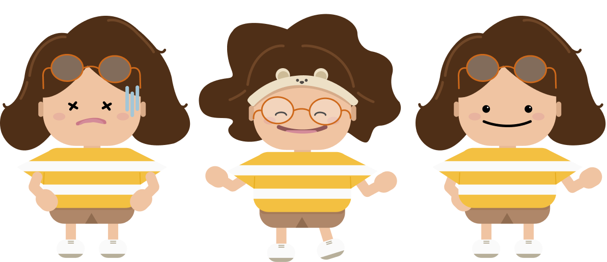
Branding elements done, illustrations done. Time to tackle something I had been putting off for a very long time.
Part Two: The portfolio site. I initially told myself I didn't need it, but I wanted to have a single place where I could host my works and case studies. That way, I wouldn't have to provide people several different links when applying for a job.
A major consideration here was the ease of updating the case studies — I wanted a way to quickly create case studies or duplicate a template whenever I wanted. This meant that the site needed a content management system (CMS), but I didn't want anything too "bloated". Just a light CMS would do, hence the decision to go with TinaCMS.
I did eventually end up just writing all of my case studies on my local drive instead of on the CMS, haha! However, it's still nice to have the CMS option ready, and a very flexible one at that. I've configured TinaCMS such that even the site structure, content tags, and links can be controlled through the CMS.
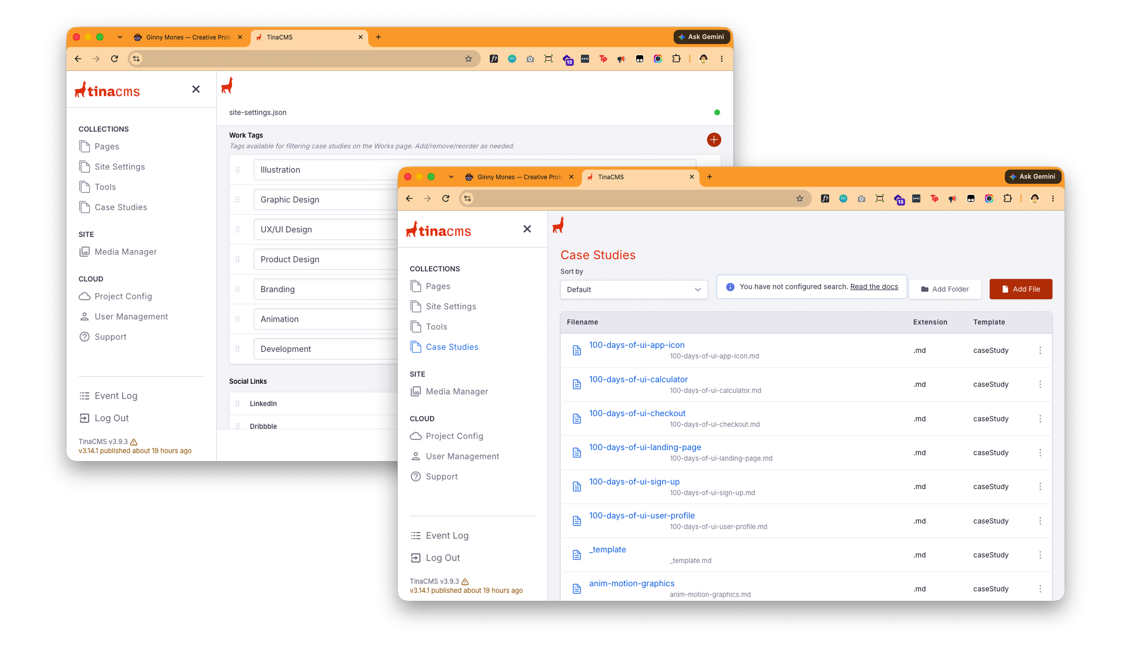
With the basic structure already built, I wanted to spend some time on the details and some micro interactions.
Part Three: While I liked the clean aesthetic of the website, I felt it needed more life. Specifically, I wanted the drawings to have a certain level of interactivity. That is why I introduced some small animations to both little Ginny and OG Ginny wherein they would blink at random intervals when the site viewer is idle, and wave if you click their left hand or arm.
I also thought adding a 404 Ginny would be a nice touch and would be in line with the goofy vibe. Gotta have some fun from time to time.
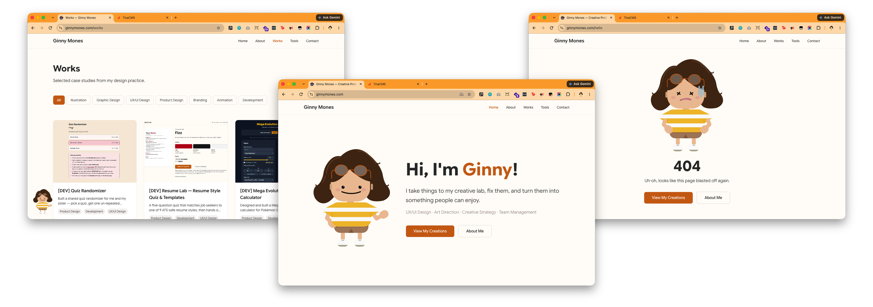
This site is far from perfect, but I'm happy and proud of what I've built. I'll keep adding more case studies, tools, and little hidden treats to my little space in the internet as I go along.
Tech & Design Stack
Built with Next.js 15 (App Router) and React 19, styled with Tailwind CSS v4 against a small custom design token set (background, foreground, and two accent colors) rather than raw hex values throughout. Content — site settings, page copy, case studies, and the /tools entries — is modeled as JSON and Markdown instead of being hardcoded into JSX, and is editable through TinaCMS, a Git-backed headless CMS with its own /admin interface, so copy and case studies can be updated without touching code. Deployed on Vercel, building from main with next-sitemap for SEO. The custom interactive character (eye tracking, blink, wave), the tag-filterable case study grid, and the social links component — which maps each link's label to a FontAwesome brand icon — were all built from scratch rather than pulled from a UI kit. Visual design was done in Figma first, with the token set and component styling implemented to match.
Results & Impact
- Replaced a static resume and a non-existent portfolio with one live site — inginnyus.vercel.app — that hosts case studies, a resume/cover letter styling flow, and a
/toolsshowcase of side projects in one place. This would later on be routed to my very own .com domain — ginnymones.com. - Every piece of copy and every case study is CMS-editable through TinaCMS, so new work can be published without opening a code editor
- Established a single reusable content model (JSON for settings/page copy, Markdown with frontmatter for case studies and tools) that let every case study and tool added after launch — including this one — slot in without new component work
- Closed the loop on the "designer to developer" story this rebrand is about: the whole site, from Figma tokens to shipped component, was designed and built solo