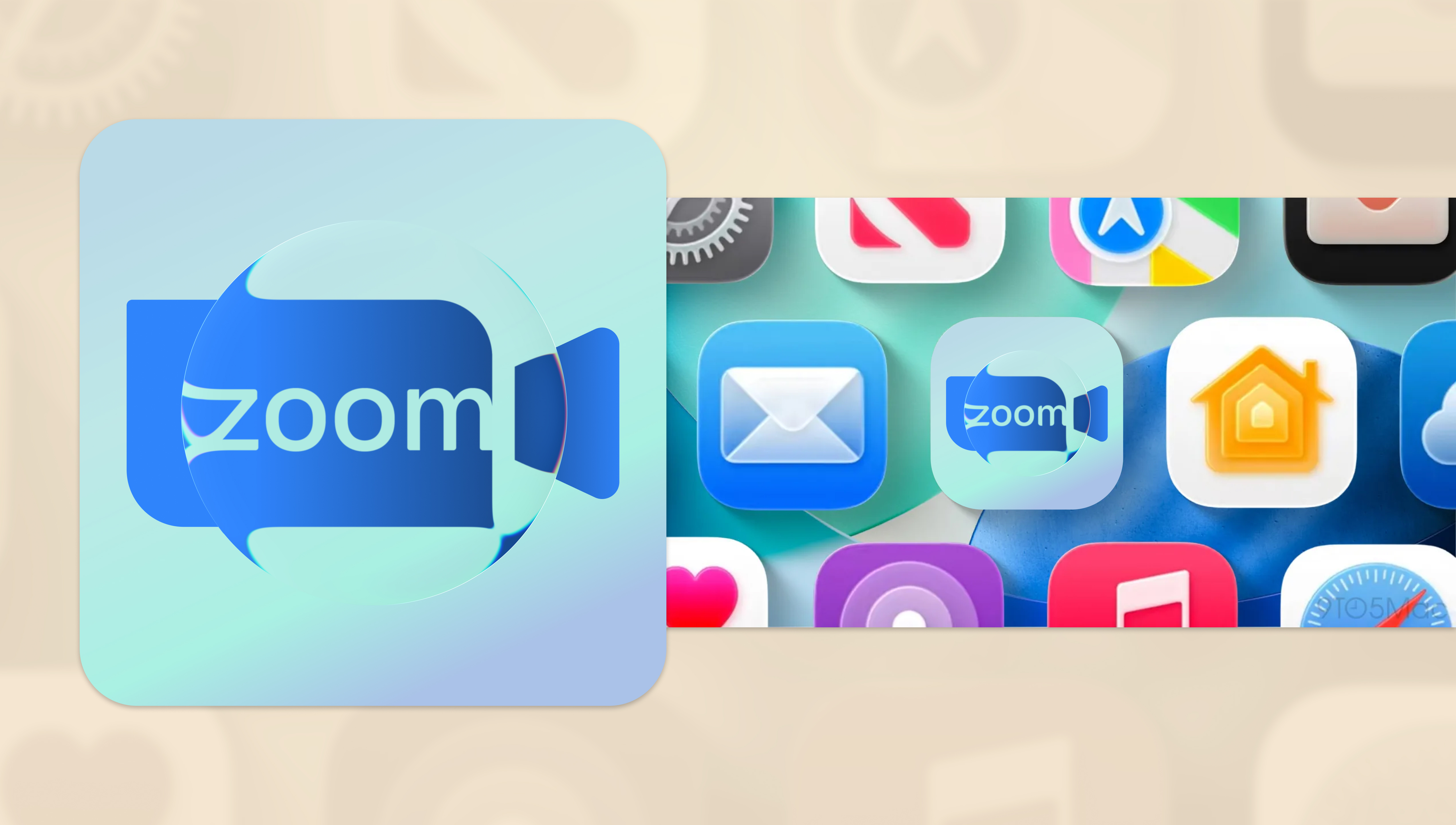
100 Days of UI Challenge - App Icon
Client: Personal ProjectFebruary 2026
Graphic DesignBranding
Problem Statement
Small canvases are always a challenge to work with as there is less space but the same number of elements to work with. The message needs to be just as clear and as effective, and it is even more challenging to grab the user's attention with a tiny graphic.
Solution
So what better way to push the envelope further than by redesigning the app icon of a well-known brand? Zoom was my top choice as it was a tool I had been using a lot recently. I wanted to bring back its classic video cam icon while also doing a play on the word "zoom", hence the use of Figma's new "glass" effect. The distortion was toned down to make the word mark more readable while still maintaining the stylized look.
Anyone else hear the Zoom call music while looking at the icon?