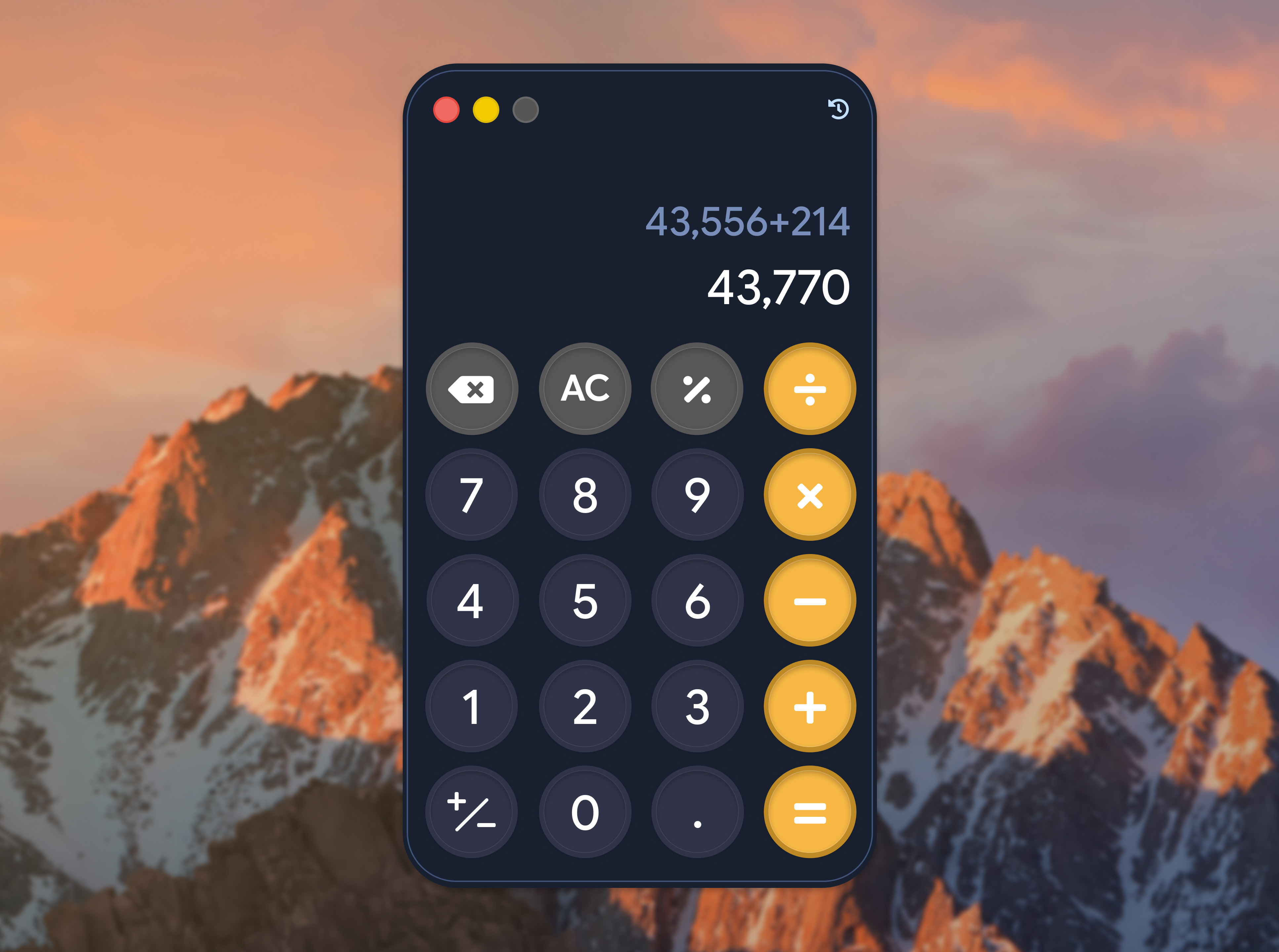
100 Days of UI Challenge - Calculator
Problem Statement
Contrary to popular belief, designing a calculator can actually be difficult. One can opt to go for a straightforward number pad with neutral colors as the styling, and that would get the job done. However, this was for a design challenge — and because of that, I was determined to put the "fun" in "functional" and create a calculator that would stimulate the user's mind instead of making them feel like they're just punching buttons.
Solution
As colors largely contribute to the overall look and feel of any user experience, I went with a deep indigo as the background color, a slightly less saturated indigo for the primary button color, and golden yellow for the operator buttons. For the font, I went with Google Sans Flex to keep the text clean but also fun and easy on the eyes.
I tried to use the same styling on the Figma Make prototype for this (check out the link above), but the tool has some restrictions when it comes to layer styles overlapping. To ensure that the prototype can be usable on both desktop and mobile, I implemented dynamic text sizing through Figma Make. The calculator is fully functional on both desktop and mobile, and also works with a keyboard.lutions are often the most simple ones. In this case, it was to keep the layout simple and streamlined.
Huge respect to calculator designers around the world. You all are the unsung heroes of the modern era.