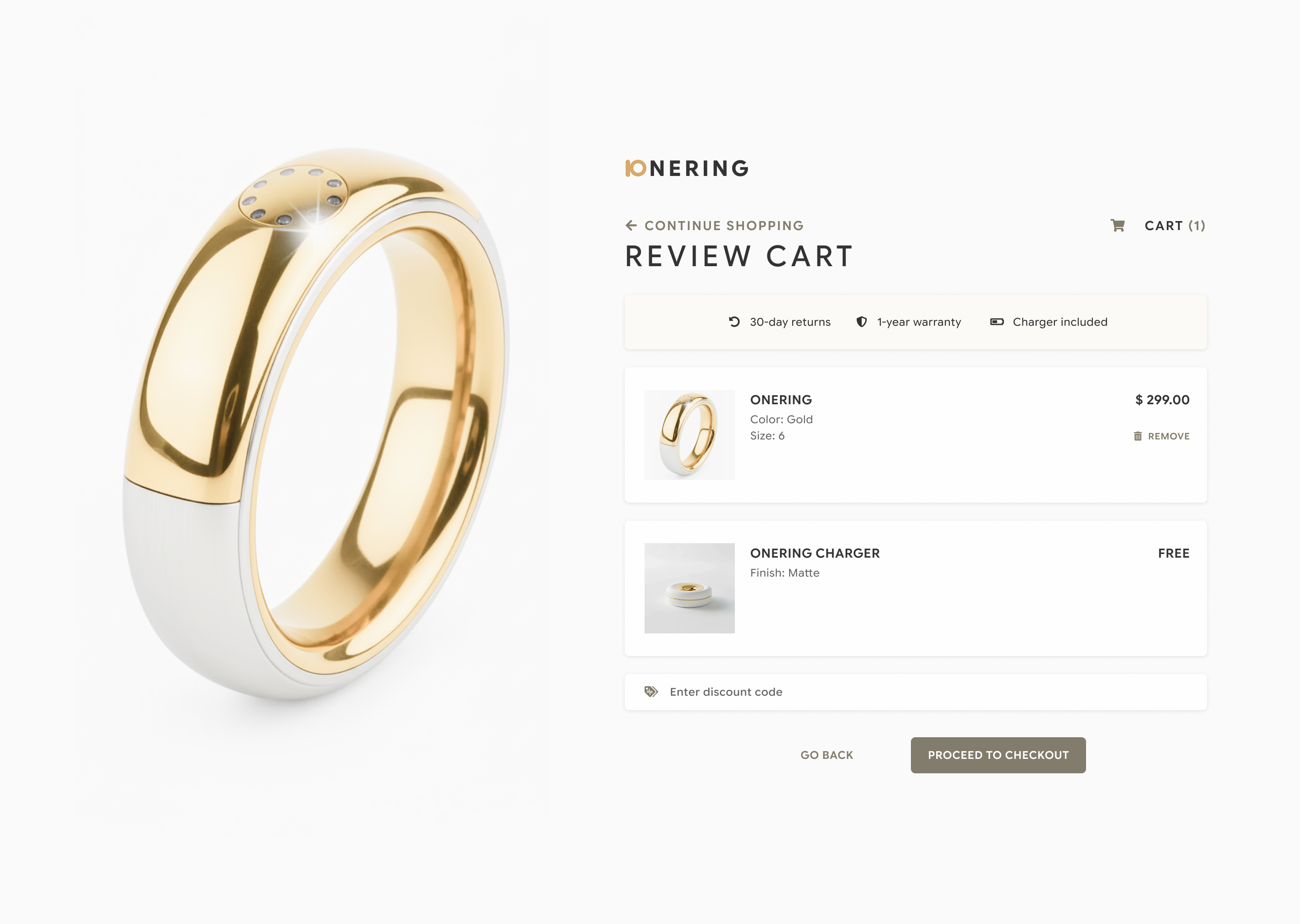
100 Days of UI Challenge - Checkout
Client: Personal ProjectJanuary 2026
UX/UI DesignBranding
Problem Statement
The challenge's second theme was "checkout". As I have been highly interested in smart rings lately, I decided to create a product — the ONERING that will rule them all (see what I did there?).
As with most checkout pages, the top priority was to highlight the most important pieces of information — the items that the user is purchasing, and the cost. Along with this, I needed to show any other perks that come with purchasing the product or the service without cluttering the page while also preserving the minimalist branding of the ONERING.
Solution
The best solutions are often the most simple ones. In this case, it was to keep the layout simple and streamlined.
Design Decisions
- For desktop, keep the interactions on one side to keep the user focused. All product and purchase information were kept on the right, following the natural reading habits of most people (left to right, with most static elements remaining on the left).
- UX cues were kept very nuanced, in alignment with the minimalist and elegant theme. The most important information (i.e. product info and prices) were placed in a pure white card with drop shadow, while the product perks were placed in a separate card with the same background color as the rest of the page, made to pop out with drop shadow. Subtle visual adjustment, big impact.
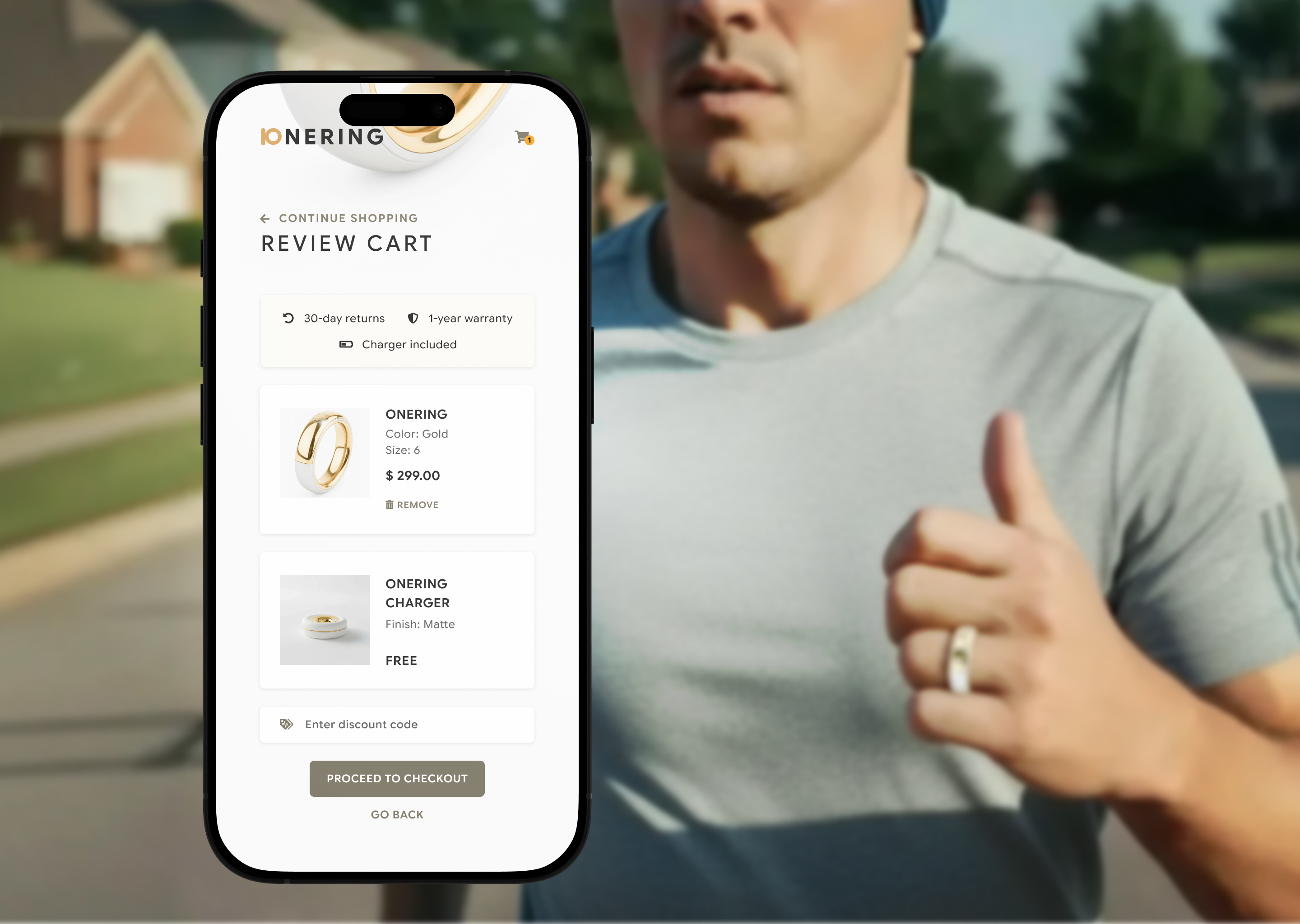
More smart ring-related designs to come from me in the future.