100 Days of UI Challenge - Sign Up
Problem Statement
Possibly the most difficult part of participating in the 100 days of UI challenge is actually starting — and starting off strong, at that. I considered a variety of different app types for the first theme "Sign Up" before determining that making a page for an imaginary astrology app was the way to go.
"Why an app where I can find my zodiac readings, though? Can't this just be a website?" It can be, but that doesn't mean we should limit to just making readings available on a website. The app is meant to be an accompaniment to the web experience, especially for those who prefer to maintain separate apps for different interests or those who simply have too many tabs open in their browser. Situating the readings in a mobile app also makes the experience more personal — something that consumers of zodiac or astrology readings usually enjoy.
Solution
My approach for this first challenge has been my go-to for nearly all design decisions I've had to make. I asked myself the following things:
- What is already working? — Daily, weekly, monthly forecasts. Users love those. Surprisingly, email notifications of said forecasts are also still effective, so reaching users through their inbox could be a viable option. People don't mind making a few extra taps to see content that is tailor-made for them.
- What is not working? — Jittery-looking page loading between the time-span views. Cluttered website layouts are also a huge problem (and a trend, unfortunately)
- What else are my users interested in? - This is important as this will help position my app as something that provides more value than the rest.
Design Decisions
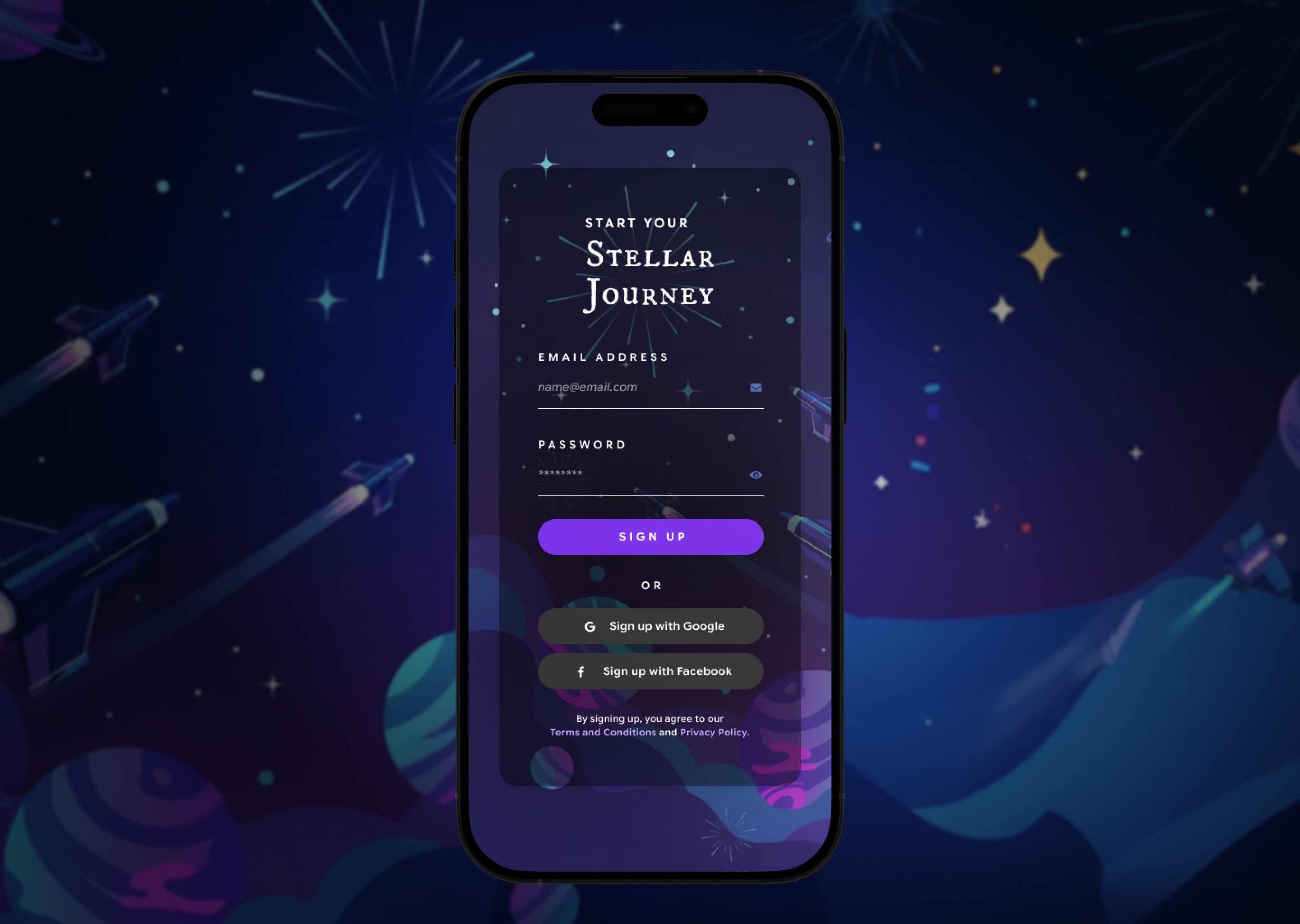
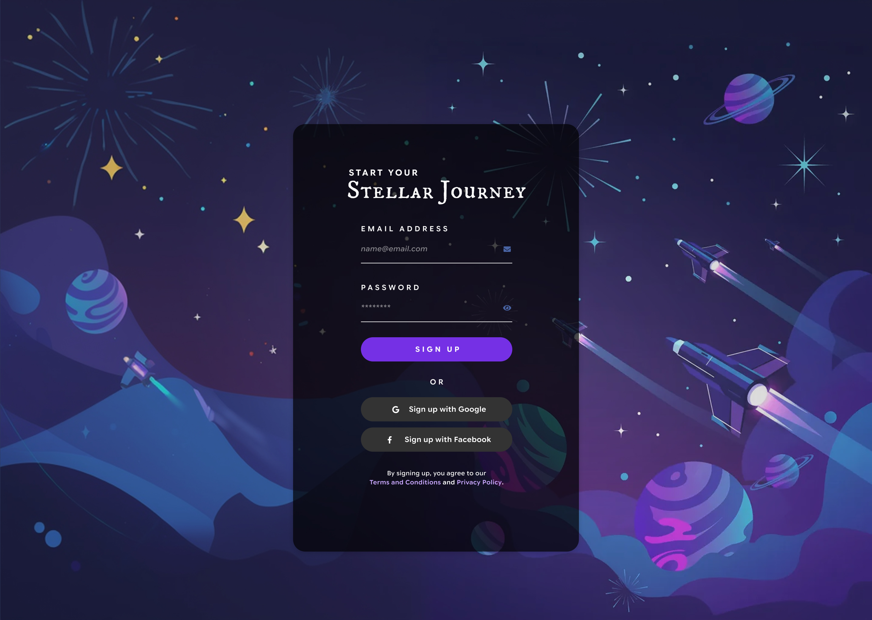
- As the goal is to design just the sign up page, I need to communicate the whole point of the app right from the get go. That means an all-encompassing copy (Start your stellar journey), striking visuals, and strong but "mystical" colors — if that makes sense.
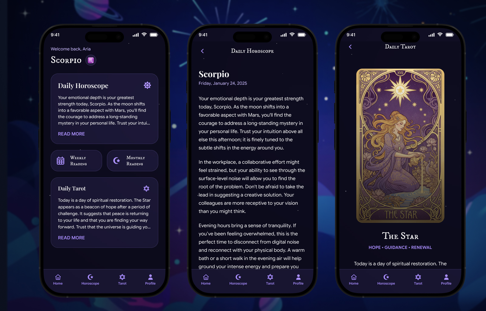
- I played around with Figma agents and whipped up some quick screens for the home, daily reading, and daily tarot pages. While AI was able to put these pages together quickly, it was not able to get the nuances of the design language that I had put together so I had to make big edits to the design.